Outdoor Digital Signage Versus Indoor – Content Differences
Posted by: Richard Williams | Posted on: | 0 Comments
Many people assume that outdoor digital signage screens seen along the high street, roadside or outside public buildings, are the same as the indoor displays seen in shopping malls, retail stores.
And many outdoor digital signage screens are just the same indoor commercial screens housed in protective LCD enclosures which prevent the weather elements from damaging the screen. LCD enclosures also have climatic controls to ensure the screens don’t overheat or freeze in cold temperatures.
But there are other essential differences when it comes to an outdoor digital signage campaign when compared to using indoor screens and many of these differences can govern the way content should be displayed in an outdoor location.

Indoor content doesn't neccessarily translate to an outdoor location
View Time
When we are meandering around a shopping centre and come across a digital display, our eyes may wonder onto it for several seconds before we make a decision if the content is relevant to us or not. However, people travel about faster in an outdoor location.
Not only do commuters walk at a quicker pace (which accelerates in bad weather) many outdoor displays are positioned so vehicle passengers can view the content when they pass. For these reasons the view time of an outdoor digital signage is a lot less and content needs to take this into account ensuring that the relevant information is always on screen regardless of what transitions or images are being displayed.
Complicated and lengthy advertisements are completely ineffective in an outdoor location so outdoor content needs to be bold, simple and to the point.
Fonts and colours
Outdoor displays have to cope with bright sunshine which can affect how content looks in an outdoor location. Colours and content that works well indoors may not look so vibrant or noticeable in an outdoor location.
Different colours work better in outdoor locations than they do indoors so ensuring the colours you choose are not only vibrant enough to be noticed but also ensuring they don’t colour clash is important.
And the same can be said for fonts. Many fonts that look great under optimum lighting are not so clear in daylight or during the night when the LCD is the main source of light. Font sizes, often need to be larger too otherwise content can be difficult to read.
Post shortlink:
Popular Products
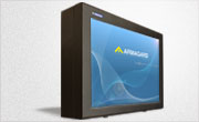
LCD Enclosure
Need armor for your LCD/LED screen(s)? Outdoors or inside the versatile LCD enclosure protects against thieves, vandals & the weather. Installation idea: NFL stadiums.
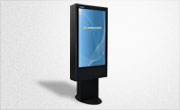
Outdoor Digital Signage
Exclusive 46” outdoor screen protection. Dubbed the ‘Totem’, due to its distinct design, it repels damage threats, but attracts audiences. Installation idea: Drive-thru restaurants.
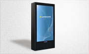
Portrait Flat Panel Enclosure
Safeguard your eye-level advertising display screen(s), indoors or outdoors. Completely customizable, add exciting features like touch screen technology. Installation idea: Restaurant frontages.
Indoor Digital Signage
Popular purchase for retail outlets! Great for ‘point of sale’ persuasion, boost your brand with static & motion advertising from a single unit! Installation idea: Mall of America.