Content Tips for Outdoor Digital Signage – Motion and Size
Posted by: Richard Williams | Posted on: | 0 Comments
Creating content for outdoor digital signage can be a real challenge. There are big differences between indoor content and outdoor content, and a common mistake made by many outdoor digital signage users is to simply transfer indoor content outside.
Different fonts, colors, motions and transitions look and are viewed completely differently outside as they do indoors and just because something has been successful inside does not necessarily mean it will translate outdoors.
Motion
One of the great advantages of digital signage is adding motion to a display. A moving image will attract the eye far better than static posters or signs; however, even with indoor signage, motion can often be over-done or interfere with readability. For outdoors, this problem is compounded by amount of time people will view the image; in an indoor environment you will have perhaps three seconds of attention to get your message across and if in that time images are just moving about without clear text, or a clear message – the purpose of the advertisement will become lost.
Outdoor digital signage has far less viewing time, especially if it is raining or it is cold; people tend to walk quicker outside than they do indoors so you perhaps, get less than a second and a half to get your message a across – wasted if images are moving about and there is no clear text.
Moving text is also a problem because people can’t really read it until it stops. Even in indoor locations the so called ticker (moving text across the bottom of the screen) has been identified as being ineffective – so outdoors it is even less worthwhile using it.
Image and Text Size
Another big difference to outdoor digital signage in comparison to indoor screens is the view distance. Commonly, outdoor signs are designed to be viewed, not just by passersby walking in the vicinity of the sign, but also by people on buses and cars driving past. For this reason outdoor signage tends to be bigger with some outdoor digital screens surpassing 70” and more.
Text size and images, therefore, need to be larger than for indoor screens; the fonts and colors need also to be bold and vibrant so they can clearly be seen at a distance and at a glance.
Post shortlink:
Popular Products
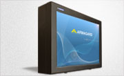
LCD Enclosure
Need armor for your LCD/LED screen(s)? Outdoors or inside the versatile LCD enclosure protects against thieves, vandals & the weather. Installation idea: NFL stadiums.
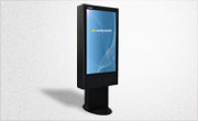
Outdoor Digital Signage
Exclusive 46” outdoor screen protection. Dubbed the ‘Totem’, due to its distinct design, it repels damage threats, but attracts audiences. Installation idea: Drive-thru restaurants.
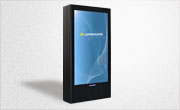
Portrait Flat Panel Enclosure
Safeguard your eye-level advertising display screen(s), indoors or outdoors. Completely customizable, add exciting features like touch screen technology. Installation idea: Restaurant frontages.
Indoor Digital Signage
Popular purchase for retail outlets! Great for ‘point of sale’ persuasion, boost your brand with static & motion advertising from a single unit! Installation idea: Mall of America.